
FRAGMENTS OF TEXTS ON A FRIEND I DON’T KNOW WHAT TO MAKE OF PUBLISHED IN THE BOOK JAN CHRISTENSEN PUBLISHER: JRP RINGIER
This complexity is manifest with particular clarity in his wall paintings, which include architectural elements with plan-drawings of the space where the painting will be hung. Let’s take as an example Untitled (Rietlandpark 375, Amsterdam), 2003, installed for the Quarantine Series in Amsterdam. On the wall, one encounters a drawing of the same space where one is standing. It might take a while to see this, but once one does, it suddenly seems self-evident. The space is reproduced on different scales and from different angles – all intertwining with one another. One can see the space slightly from above, from the side, and one always feels as if one is trying to find the spot in the drawing where one is standing. The painting uses the distortions in one’s vision too, playing with perception and the way the eye seeks the familiar within the distortions and always tries to make sense out of what might not make perfect sense. The wall painting also folds and follows the corners of the walls, spiting the fact that walls end or turn. It just continues over the edges and corners. If there can be a flat painting that is three-dimensional this is it. The painting thus plays with one’s perceptions in a wide variety of ways at the same time, and confounds the way one senses the space and the architecture.
And yes, the aesthetic impetus behind Christensen’s paintings is indeed very forceful. I would characterize it as the most important characteristic for those trying to approach his paintings. If one were to be kind, one would describe Christensen’s palette as lively, were one less kind, the operative term would be “brutal.” The colors are all candy, clear and bright, and together create something that readily catches the eye, to put it mildly. Christensen is definitely not afraid of red, yellow, and blue; or pink, or turquoise, or orange or any other color in the spectrum; on the contrary, he seems very comfortable using these colors. The early Optical Sound (#1), 2000, a blown-up detail of a photograph, plays not only with colors but also with perception (again), and with reality and reproduction. As a viewer, your attention is quickly drawn to the colorful painting. In 2004, Christensen took another step, adding some more layers and perceptional illusions in a follow-up, Optical Sound (#3). Here he simulated the color overlays in the CMYK-printing process. One has to remind oneself that this is still a painting, done in many layers, and not just a large-scale print.
The formal as well as the visual aspects are crucial to his work, as well as the expanded time and space coordinates that demand an immediateness while still functioning on every layer they are placed, clearly distinct from the layer next to it. Adding to this complexity are, in other works, the numerous references to other artists and other works in the history of art, as well as to other spaces or images in popular culture, for example record covers, graphic design elements, or even the software tools used for the design itself, all of which creates multiple layers of information and gives hints about the work process (see for instance Dangerous Driving, 2002 with a large vinyl sticker on top of the painting, where one sees “Illustrator 9.0 Tool Box”).
Yes, an reference can easily be seen to Michel Majerus, another great (wall) painter who worked in complex layers, and who expanded and transformed the room/space with his paintings, and who, indeed, expanded the very concept of painting itself. In fact, Jan is forever linked to Majerus for me on a personal as well as professional level, since it was Jan who first suggested Majerus for a wall painting I later commissioned in Stockholm with the Luxembourg painter. Having had the tremendous opportunity to be involved with both artists in the actual creation of some of their works, I see the strong interrelations between the two artists, but I also see how the two artists diverge in both method and approach. While Majerus definitely placed more emphasis on formal aspects in his work, and was originally trained as a more traditional painter, Christensen – who by no means takes painting or the tradition of painting lightly (he got into art by painting copies of the old master Vermeer) – uses his graffiti background as a method to combine images and aesthetics, and to make use of a wide range of references in his work. When adding and appropriating other elements of painting (or architecture) into his painting, he’s not merely repeating the elements, but of course putting them into his own perfect timelessness. Paradoxically, the temporality of most of the wall paintings enhances the sense that the paintings are have transcended time rather than have diminished it.
Most of the paintings will be covered with a thick layer of white before the next exhibition opens in the very same space. Here, it is also quite easy to draw a parallel to the temporality of graffiti, where the tags have relevance for as long as they remain, but somehow almost always are removed or painted over by another tag or the “original” color of the background. The temporality that lies within the medium of wall paintings is also something mournful; take it from someone who has “destroyed” the wall paintings of Christensen (and Majerus’ too) with white wall paint after the show was finished. At the same time, one also breathes a sigh of relief. Of course, the paintings will still exist, to be able both to be sold and repeated in another space – unless otherwise stated by the artist, which in fact also makes the paintings immortal, but the most important factor with the temporary temporality is that it allows a certain amount of playfulness and openness in the process of installing the work itself. In some paintings, the combination of experimentation and melancholy is striking, since they at first seem to have side-stepped the perfectionist aesthetic that characterizes most of Christensen’s work. A typical example of this is the series Painting Myself Into a Corner, 2004 and 2005, which documents Christensen quite literally having painted himself into various corners. Honestly, I was a bit worried when I first saw the documentation of the first painting in the series, which was done in the corner of some yard in Berlin with bright yellow paint. Could this be a crude expression of an artistic crisis? Maybe it was, maybe it wasn’t, it doesn’t really matter – the painting speaks for itself.
Another work that I regard as somehow closely connected to Painting Myself into a Corner is not actually a painting, although, with its twisted sense of humor, it is similar. The medium happens to be a stamp, and the connection to Painting Myself into a Corner exists not merely by dint of the inherent odd sense of humor. The imprint also manifests the theme of repetition, which is common to both works, and, indeed, to many of Christensen’s work. The words in the imprint seem to have been written by hand, in a hurry, in capital letters, on a post-it note, and include a crossed-out misspelling: HOW COME YOU’RE NEVER AROUND ANYMORE? which is also the title of the work. The confrontational question may have been directed at somebody in particular, but this we can only surmise. The fact is, the work has the effect of shifting perspectives, and it pulls you in, along with your memories and experiences. It seems to be the kind of introverted scribbling anyone might engage in from time to time. This is a piece which might be very personal, at the same time that the completion of the work is left open to “the eye of the beholder.” Then you have the reproduction of the stamp which turns it all around. The medium of the stamp says something else, it speaks of something impersonal and the technique implies something universal. There is a sudden distance here. The reproduction acts as the stronghold that counters the sticky sentimentality that could be read into the words. Still, the romanticism that lies within prevails, and it is that which remains, like a lump in the throat, like the doubt and uncertainty that I had after seeing the first photos of the artist painting himself into a corner.
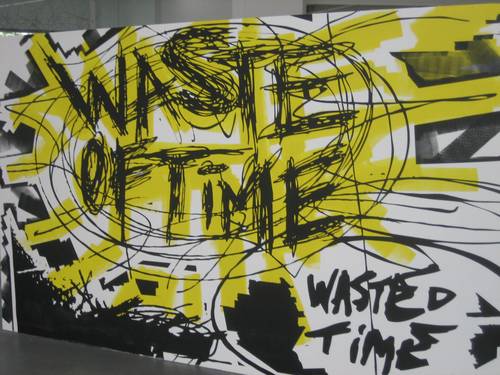
In the piece Some Titles for Which I Don’t Know What to Make, 2004 (Berlin) the gloomy scribbler appears again, here in the smashing colors and in the multiple layering that is Christensen’s trademark. Not every sentence in the piece is to be deciphered as they cross each other and intertwine. One sentence is more clear than the other in the oversize piece; “This is not the worst I’ve looked, it’s just the most I’ve ever cared.” In the “sequel” to this work, More Titles for Which I Don’t Know What to Make, 2004 (Oslo) the bright colors are left out, but the layers of overblown, intertwining sentences are still there, and so is the dark mood. The perfectionist approach, the glossy surface, the bright colors and the and the slickness, which functions as a uniting factor, construct the antithesis that seem to hold the reins of an underlying dystopia that threatens to pop up every now and then – and which might have a raw and forceful eruption in Painting Myself into a Corner. And what exactly happens after one has painted oneself into a corner? Well, in the same exhibition in Oslo where he did the third installment of the series, a looped video piece simply concluded “No input,” No Input, 2004.
The spectacular layer-on-layer technique Christensen uses, combined with a unique execution, where time and space are not only expanded but extended and completely transformed, together with cunning wordplay and a splendid sense of strategy, are all fabulous traits in Christensen’s body of work. But it is the dichotomy between dystopia and cheerful glossiness, exactly like the one Christensen expressed when he and I chatted about the piece I Will Never Make It a long time ago, which is what makes Christensen’s work truly captivating.
Power Ekroth
Prologue: In 2003 Jan Christensen won the grand prize in the National Annual Autumn Exhibition (Høstutstillingen) in Oslo for I Will Never Make It (with an additional work done together with Øystein Aasan).