
Paul Bonet
Drawings for Bookbindings
04 May - 16 Jun 2018
Paul Bonet
Drawings for Bookbindings
compiled by Florian Pumhösl
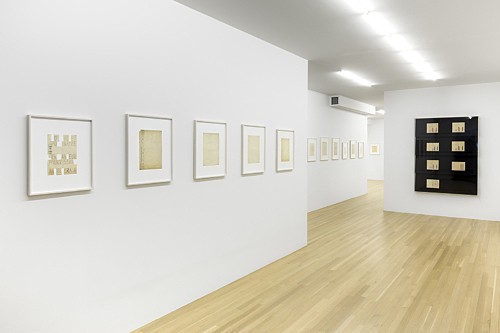
installation view Galerie Buchholz, New York 2018
Drawings for Bookbindings
compiled by Florian Pumhösl
installation view Galerie Buchholz, New York 2018
PAUL BONET
Drawings for Bookbindings
4 May – 16 June 2018
compiled by Florian Pumhösl
Paul Bonet’s Cartonnages first drew my interest a few years ago: bindings for small literary volumes published in modest print runs that are now a fixture of French antiquarian bookstores. What appealed to me more than anything else was the serialism of the geometric compositions and their comparatively discreet quality: the covers bear no titles, let alone illustrations or photographs; the authors’ names and, in much smaller print, the titles are relegated to the spines. Each author appears to have his own dedicated compositional scheme: horizontal bands resembling piano keyboards in reddish orange and black for Malraux; kaleidoscopic semicircular gold-embossed formations arranged in various symmetries within a dot grid pattern for André Gide; compositions based on horizon lines of varying widths for Paul Valéry; etc.
These designs – some look abstract and austere, while a few others feature figurative representations or veritable clusters of heraldic or calligraphic symbols – cast a spell over me that has not faded. One reason may be that they seem not to conform to any of the design categories of avant-garde book art or modernist graphic art, which generally seek to strike a balance between the title (i.e., the printed word), an illustration (or non-illustration), and compositional attributes that, however independent of these primary elements they may appear to be, usually serve to underscore the content. Traditionally, the embossed cover is a self-contained item, its design separate from that of the book; in many cases, it is simply the binding into which a book or manuscript was inserted for a library. The title as a required identifier is placed accordingly on the spine; the front and back covers are designed to match the library, not the content they enclose. This convention leaves room for embellishments and graphic structures that constitute a distinctive texture irrespective of the book’s content. The book, that is to say, bears no cover in today’s sense; rather, its face is a kind of blank.
The idea for this exhibition grew out of initially one, then several “finds”: design drawings, embossing stencils, and gouaches by Bonet, preliminary designs and fragments from his output. Each attests to the design system rooted in Bonet’s style and craftsmanship: compositional sketches, fine-drawings with a number system for the embossing clichés, as well as painted drafts for book covers destined for further revision. Combining embossed, drawn, and painted templates, they include color specifications and numberings; Bonet uses basic graphic elements (i.e., lines and circles) as well as ornamental stamps and metal lettering.
These drawings by Bonet are part of a larger oeuvre of bookbindings that spans the period from 1925 until his death in 1971. Bonet is regarded as a leading French designer of Art Deco embossed covers, a stylistic label that best fits his early oeuvre. (He explicitly acknowledged the earlier designers, such as Pierre Legrain and Rose Adler, from whose work he drew inspiration.) The bookbindings created by the reliure artists of the twentieth century form a distinctive strand that is closely interwoven with the French cultural and intellectual life of their time. Bonet’s individual style stands out most importantly for its musical quality; the characteristic feature of his designs is the almost incantatory repetition of forms. In a set of works for the popular market, the 552 designs for the Cartonnages de la NRF published by Gallimard, Bonet adapts his style to embossed cardboard.
We have assembled selected drawings in small groups that illustrate Bonet’s approach, how he went about drafting an individual design or system of elements. As I studied his drawings, the functional aspect—the book object as the ultimate focus of all efforts—tended to recede from view. What makes these works singular is the way they negotiate a blank surface, their amplifying, concentrating, and dismantling of forms, a distinctive voice that accompanies that of a literary work.
F.P.
Galerie Buchholz is proud to announce that this exhibition will travel to CAPC musée d’art contemporain in Bordeaux, France this coming fall.