Matt Connors
25 Apr - 01 Jun 2014
MATT CONNORS
Machines
25 April - 1 June 2014
CANADA is pleased to present “Machines” a solo exhibition by Matt Connors. It might be tempting to read Connors’ project as theoretical, but this is disrupted by a strong lyrical component in the work that registers on an emotive level. To reinforce this contrast Connors has built an installation in the front space of the gallery that serves to prime or (dis)orient the viewer; large temporary walls disrupt the passage of a normal gallery walk from the street to the rear exhibition space. The physical impediment is confounded and complicated by carefully chosen wall paint color, asking us to view the monoliths not as walls but as painted sculptures or freestanding paintings. The context becomes the subject. The considered frames for drawings, the correct weave of the canvas, the fugitive splats of acrylic color all seem to reinforce this point. The smallest seemingly unimportant detail is dignified, like the edge in a Jo Baer painting. Connors stretches the bounds of subject matter and we are rewarded with the surprise of how elastic art can be...it works!
It is funny to think of paintings as machines, as the show’s title suggests. A machine, simply defined, is an object made to harness energy to perform a specific task. Is that what a painting does? Maybe, but perhaps the title is meant to provoke us beyond this point. Machines were an important touchstone for modernist artists and an important metaphor for modernism’s progressive ethos neatly summed up by Ezra Pound’s statement that art, like an ever-improving technology, must “make it new”. The “task” these machines do is subtle and a little difficult to tease out, but it is real. It is about harnessing the power of our collective recognition of painting ideas and turning them around, undoing them a little bit to show the pathos and lost desire of a grand project.
Matt’s Machines
An essay by Wayne Koestenbaum
Matt Connors’s new paintings—he calls them Machines, as if with an ironic, sweet-tempered nod to Futurism—apparently have arisen from accidents, fortuitously arranged; a master of closure, he knows when to stop the painting (sometimes almost before it starts). He knows how to stumble and to catch himself (and anoint himself) in the moment of pratfall. He knows how to be at peace with a philosophy of maximum ease and liberty—and not to pester or guilt-trip himself because this equanimity has come to him with the obviousness of a birthright, just as the ocean may know that rocks and sand and jellyfish and whales are its briny, unsought privilege.
*
In a new Matt Connors painting named (with autoerotic insouciance) Self-translating, the red events (or blobs, or rectangles) don’t befriend the blue and green and yellow compatriots hovering near. The virtue of a painting (as opposed to a dinner party) is that the gathered blobs needn’t converse with each other. Lines, dots, circles, lumps, stacks—these events (each Matt Connors painting is a composite or anthology of events) betray no anxiety about the proximity of other occurrences. We don’t need chronology, a Matt Connors art-work says. We live in our cube of time, whose walls leave our moods unmolested.
*
In another new work, Are You, the events bleed to the canvas edge; the red event and the orange event each contain a trespassing stain, whose fringy contours say spill, say leak, say fortunate error. (Milton, in Paradise Lost, called our explusion from Eden a “fortunate fall”; Connors, like Milton, finds a felix in every culpa.) Matt’s atmosphere forgives errors before they happen and while they are happening. As viewer, looking at Are You, I come to a decision about rectangles, doors, epitaphs, and sepulchers. I decide to regard the visible world as heimlich, rather than as a terrifying sequence of monoliths that aim to exile me from bodily self-sureness. InAre You, three blue speckles compromise green’s desire to remain solely green; simultaneously, three greenish speckles live beneath orange-red’s serene fiefdom. Confronting these hiccups of sublimity, I can only giggle, as if Matt had whispered to me a joke about the universe’s uncannily perfect construction, a system clever enough to stymie global warming.
*
In another new work, Second Witch’s Hat, the events take the guise of circle, half-circle, squiggle, dash, and triangle. (These names, approximations, can’t do justice to his complex retinue of forms.) The painting impersonates neutral-voiced abstraction but is actually chummy. The forms say “Uncle!” in the middle of the wrestling match, and then they flop onto the mat, as if fainting with fatigue and surfeit. No shape in a Matt Connors painting wants to harrass. His forms stumbled into their identity; they didn’t grab percipience. Selfhood, or the ability to say “I,” landed on them, with a purple splash, and they accepted the grapy benediction. A blue ball, sitting atop a blue tongue, seems to slide forward, or topple; the dancing instability of the shapes (when regarded as ambulatory trajectories) counterpoints their monochrome stability, their lumpenequipoise.
*
A painting enigmatically called Four has no good reason to be called Four. Or maybe it has several good reasons. After all, it contains four colors (yellow, red, blue, and green); it has four sides; and its two blue rectangles have a total of four green closures dwelling on top and bottom of the blue. Yellow dominates the painting’s field and constitutes its background, though red seems to live behind the yellow, and peer forward, in tiny gloryholes or snags. This painting foists on you a conundrum: be inside the yellow I thrust upon you, but don’t identify with the yellow entirely. Or, if you identify with the yellow, allow part of your self-love to rest (like a thumbtack) on the blue and red interruptions that I pretend to consider impediments but that I actually understand to be my underlying sorrow’s antidote.
*
With what gestures (of welcome, of commiseration) do we greet works on paper? Do we love them more? Do we wish to protect them and give them extra kisses? Matt Connors’s several new (untitled) works on paper, not monumentally sized, radiate a birthday sweetness, exactly at the vague point where frivolity meets melancholy. Notice, in one such work, when an orange vertical stripe balances on top of a blue vertical stripe, that the orange stripe is perforce more vulnerable than the blue (because the orange stripe is smaller, and because its resting point, on the blue, is only the size of a wart or a nipple, hardly a stable ground on which to depend). Notice, too, that the orange stripe comports itself with an off-kilter, Chaplinesque melancholy; however, if we wish to minimize sadness, we could decide that the orange stripe is the victor, and that its blue twin, though seemingly a stern bottom, contains stains and internalized green rivulets that undermine its reign of peerless blue. Notice that Matt Connors’s paintings and drawings offer horoscopes about mood, about emotional equilibrium or disequilibrium. Notice how relentlessly I feel invited to psychologize the predicaments that his choreographed shapes and colors propose. And notice, dear reader, that to psychologize is not necessarily to condemn. Our moods may determine our relation to Connors’s optically titillating and formally “simple” work (we know how complex simplicity can be), but his paintings refuse to hazard verdicts about our emotional states.
*
In his new painting Have You, three vertically arrayed rectangles, nearly touching each other, but with what appears to be a colored pencil line interrupting their congress, teach the eye how to understand size difference without paying homage to it. Josef Albers paid homage to the square, and the square deserved it. The square thanked Albers for the praise. But now the square, tired of tribute, wants a few unclassified hours alone. Matt Connors gives us rectangles with an Albers-like sense of how majestic an elementary geometric shape can be, or with a consciousness (like Ellsworth Kelly’s) of how color and form determine our proprioception and our ability to thrive; but Connors’s contribution to the century-old drama of the gifted shape is to float the drama, and to flout it—not to ironize the abstract spectacle, or to frighten us away from its gilded cage, but to let the geometric pageantry (a saga we’ve memorized from minimalism and abstract expressionism and color field painting and dozen other movements) hover in air a few feet higher than our ability to classify and shame it. By flouting the heavy stakes implied by his reduced, august vocabulary, and by rendering this lexicon with a color “scheme” brighter and more fanciful than mastery will usually admit, Connors gives us the effervescence and the libidinal naughtniness of the floating world and the “trippy” uncanny, like eyes gone blind from staring directly into Malibu sun.
*
In the words of Connors’s new painting Direct Address, I am trying to address directly the lightness of his work and its heaviness, too; trying to address directly why the simple red and yellow stripes or rectangles (or both) seem to come in couples (yellow + red) but also in threesomes (red + yellow + red) (yellow + red + yellow). The eye wants to organize the painting, although the composition’s sublime indifference to fuss and bother relieves us of administrative responsibility. Simplicity isn’t a difficult grail. Simplicity is a boon that you can grab right now. Notice how a simple yellow or red shape effects your body. Let the red or yellow rectangle—or stroke—make an easeful impact upon your nervous system. And then figure out whether you will bother to describe this impact to another human being, or whether you will consider this tiny event to be a private, ineffable occurrence that proves your near-tragic separation from any community of like-minded souls. And yet Matt’s paintings opt for gregariousness; his colorful play of forms makes you renounce fears that aesthetic experience (another word for bodily experience, for neurological event) must remain incommunicable.
*
Too simple? Too easy? Too beautiful? Too luxurious? Too austere? Too cerebral? Too stained? Too clean? Too striped? Too pink? Too orange? The squadron of fuss-and-bother will wonder about these questions. The rest of us will understand that a hand—Matt’s—made certain impressions on canvas or paper. Maybe he didn’t even use his hand. Maybe he allowed gravity or the mutual masturbation of canvas and canvas to produce marks and inlets. However the impressions were made on canvas or paper, those of us who oppose fuss-and-bother will understand that Matt fabricated these paintings and therefore that we who look at them, we who receive their impress, are receiving a direct “hit” from the painter’s eye. These shapes and colors contain the echo of his wish. He instigated these marks but then he stepped back and observed their effect. He decided that he found their effect charming. Around that moment of decision, an interval of silent contemplation established itself. That oasis is what he gives us. He bestows on us the space of Matt looking at the event and feeling the event’s weird impact, a concussion or caress impossible to organize into words.
-April, 2014
Machines
25 April - 1 June 2014
CANADA is pleased to present “Machines” a solo exhibition by Matt Connors. It might be tempting to read Connors’ project as theoretical, but this is disrupted by a strong lyrical component in the work that registers on an emotive level. To reinforce this contrast Connors has built an installation in the front space of the gallery that serves to prime or (dis)orient the viewer; large temporary walls disrupt the passage of a normal gallery walk from the street to the rear exhibition space. The physical impediment is confounded and complicated by carefully chosen wall paint color, asking us to view the monoliths not as walls but as painted sculptures or freestanding paintings. The context becomes the subject. The considered frames for drawings, the correct weave of the canvas, the fugitive splats of acrylic color all seem to reinforce this point. The smallest seemingly unimportant detail is dignified, like the edge in a Jo Baer painting. Connors stretches the bounds of subject matter and we are rewarded with the surprise of how elastic art can be...it works!
It is funny to think of paintings as machines, as the show’s title suggests. A machine, simply defined, is an object made to harness energy to perform a specific task. Is that what a painting does? Maybe, but perhaps the title is meant to provoke us beyond this point. Machines were an important touchstone for modernist artists and an important metaphor for modernism’s progressive ethos neatly summed up by Ezra Pound’s statement that art, like an ever-improving technology, must “make it new”. The “task” these machines do is subtle and a little difficult to tease out, but it is real. It is about harnessing the power of our collective recognition of painting ideas and turning them around, undoing them a little bit to show the pathos and lost desire of a grand project.
Matt’s Machines
An essay by Wayne Koestenbaum
Matt Connors’s new paintings—he calls them Machines, as if with an ironic, sweet-tempered nod to Futurism—apparently have arisen from accidents, fortuitously arranged; a master of closure, he knows when to stop the painting (sometimes almost before it starts). He knows how to stumble and to catch himself (and anoint himself) in the moment of pratfall. He knows how to be at peace with a philosophy of maximum ease and liberty—and not to pester or guilt-trip himself because this equanimity has come to him with the obviousness of a birthright, just as the ocean may know that rocks and sand and jellyfish and whales are its briny, unsought privilege.
*
In a new Matt Connors painting named (with autoerotic insouciance) Self-translating, the red events (or blobs, or rectangles) don’t befriend the blue and green and yellow compatriots hovering near. The virtue of a painting (as opposed to a dinner party) is that the gathered blobs needn’t converse with each other. Lines, dots, circles, lumps, stacks—these events (each Matt Connors painting is a composite or anthology of events) betray no anxiety about the proximity of other occurrences. We don’t need chronology, a Matt Connors art-work says. We live in our cube of time, whose walls leave our moods unmolested.
*
In another new work, Are You, the events bleed to the canvas edge; the red event and the orange event each contain a trespassing stain, whose fringy contours say spill, say leak, say fortunate error. (Milton, in Paradise Lost, called our explusion from Eden a “fortunate fall”; Connors, like Milton, finds a felix in every culpa.) Matt’s atmosphere forgives errors before they happen and while they are happening. As viewer, looking at Are You, I come to a decision about rectangles, doors, epitaphs, and sepulchers. I decide to regard the visible world as heimlich, rather than as a terrifying sequence of monoliths that aim to exile me from bodily self-sureness. InAre You, three blue speckles compromise green’s desire to remain solely green; simultaneously, three greenish speckles live beneath orange-red’s serene fiefdom. Confronting these hiccups of sublimity, I can only giggle, as if Matt had whispered to me a joke about the universe’s uncannily perfect construction, a system clever enough to stymie global warming.
*
In another new work, Second Witch’s Hat, the events take the guise of circle, half-circle, squiggle, dash, and triangle. (These names, approximations, can’t do justice to his complex retinue of forms.) The painting impersonates neutral-voiced abstraction but is actually chummy. The forms say “Uncle!” in the middle of the wrestling match, and then they flop onto the mat, as if fainting with fatigue and surfeit. No shape in a Matt Connors painting wants to harrass. His forms stumbled into their identity; they didn’t grab percipience. Selfhood, or the ability to say “I,” landed on them, with a purple splash, and they accepted the grapy benediction. A blue ball, sitting atop a blue tongue, seems to slide forward, or topple; the dancing instability of the shapes (when regarded as ambulatory trajectories) counterpoints their monochrome stability, their lumpenequipoise.
*
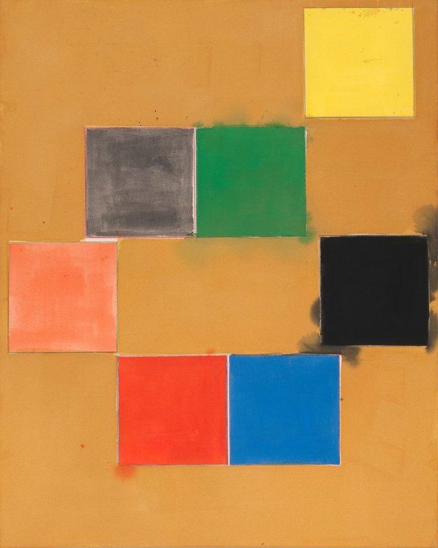
A painting enigmatically called Four has no good reason to be called Four. Or maybe it has several good reasons. After all, it contains four colors (yellow, red, blue, and green); it has four sides; and its two blue rectangles have a total of four green closures dwelling on top and bottom of the blue. Yellow dominates the painting’s field and constitutes its background, though red seems to live behind the yellow, and peer forward, in tiny gloryholes or snags. This painting foists on you a conundrum: be inside the yellow I thrust upon you, but don’t identify with the yellow entirely. Or, if you identify with the yellow, allow part of your self-love to rest (like a thumbtack) on the blue and red interruptions that I pretend to consider impediments but that I actually understand to be my underlying sorrow’s antidote.
*
With what gestures (of welcome, of commiseration) do we greet works on paper? Do we love them more? Do we wish to protect them and give them extra kisses? Matt Connors’s several new (untitled) works on paper, not monumentally sized, radiate a birthday sweetness, exactly at the vague point where frivolity meets melancholy. Notice, in one such work, when an orange vertical stripe balances on top of a blue vertical stripe, that the orange stripe is perforce more vulnerable than the blue (because the orange stripe is smaller, and because its resting point, on the blue, is only the size of a wart or a nipple, hardly a stable ground on which to depend). Notice, too, that the orange stripe comports itself with an off-kilter, Chaplinesque melancholy; however, if we wish to minimize sadness, we could decide that the orange stripe is the victor, and that its blue twin, though seemingly a stern bottom, contains stains and internalized green rivulets that undermine its reign of peerless blue. Notice that Matt Connors’s paintings and drawings offer horoscopes about mood, about emotional equilibrium or disequilibrium. Notice how relentlessly I feel invited to psychologize the predicaments that his choreographed shapes and colors propose. And notice, dear reader, that to psychologize is not necessarily to condemn. Our moods may determine our relation to Connors’s optically titillating and formally “simple” work (we know how complex simplicity can be), but his paintings refuse to hazard verdicts about our emotional states.
*
In his new painting Have You, three vertically arrayed rectangles, nearly touching each other, but with what appears to be a colored pencil line interrupting their congress, teach the eye how to understand size difference without paying homage to it. Josef Albers paid homage to the square, and the square deserved it. The square thanked Albers for the praise. But now the square, tired of tribute, wants a few unclassified hours alone. Matt Connors gives us rectangles with an Albers-like sense of how majestic an elementary geometric shape can be, or with a consciousness (like Ellsworth Kelly’s) of how color and form determine our proprioception and our ability to thrive; but Connors’s contribution to the century-old drama of the gifted shape is to float the drama, and to flout it—not to ironize the abstract spectacle, or to frighten us away from its gilded cage, but to let the geometric pageantry (a saga we’ve memorized from minimalism and abstract expressionism and color field painting and dozen other movements) hover in air a few feet higher than our ability to classify and shame it. By flouting the heavy stakes implied by his reduced, august vocabulary, and by rendering this lexicon with a color “scheme” brighter and more fanciful than mastery will usually admit, Connors gives us the effervescence and the libidinal naughtniness of the floating world and the “trippy” uncanny, like eyes gone blind from staring directly into Malibu sun.
*
In the words of Connors’s new painting Direct Address, I am trying to address directly the lightness of his work and its heaviness, too; trying to address directly why the simple red and yellow stripes or rectangles (or both) seem to come in couples (yellow + red) but also in threesomes (red + yellow + red) (yellow + red + yellow). The eye wants to organize the painting, although the composition’s sublime indifference to fuss and bother relieves us of administrative responsibility. Simplicity isn’t a difficult grail. Simplicity is a boon that you can grab right now. Notice how a simple yellow or red shape effects your body. Let the red or yellow rectangle—or stroke—make an easeful impact upon your nervous system. And then figure out whether you will bother to describe this impact to another human being, or whether you will consider this tiny event to be a private, ineffable occurrence that proves your near-tragic separation from any community of like-minded souls. And yet Matt’s paintings opt for gregariousness; his colorful play of forms makes you renounce fears that aesthetic experience (another word for bodily experience, for neurological event) must remain incommunicable.
*
Too simple? Too easy? Too beautiful? Too luxurious? Too austere? Too cerebral? Too stained? Too clean? Too striped? Too pink? Too orange? The squadron of fuss-and-bother will wonder about these questions. The rest of us will understand that a hand—Matt’s—made certain impressions on canvas or paper. Maybe he didn’t even use his hand. Maybe he allowed gravity or the mutual masturbation of canvas and canvas to produce marks and inlets. However the impressions were made on canvas or paper, those of us who oppose fuss-and-bother will understand that Matt fabricated these paintings and therefore that we who look at them, we who receive their impress, are receiving a direct “hit” from the painter’s eye. These shapes and colors contain the echo of his wish. He instigated these marks but then he stepped back and observed their effect. He decided that he found their effect charming. Around that moment of decision, an interval of silent contemplation established itself. That oasis is what he gives us. He bestows on us the space of Matt looking at the event and feeling the event’s weird impact, a concussion or caress impossible to organize into words.
-April, 2014