
on paper
10 Jan - 04 Mar 2009
ON PAPER
Josef Albers, Pierrette Bloch, Louise Bourgeois, James Brown, Jonathan Callan, Tony Cragg, Ding Yi, Alexander Gorlizki, Gotthard Graubner, Henri Michaux, Norbert Prangenberg, Gideon Rubin, Carole Seborovski, Louis Soutter, Wu Yiming
The Karsten Greve Gallery is pleased to announce the opening of its exhibition On Paper, a selection of works on paper that show how contemporary artists from different horizons approach this technique. Even though there is often a certain spontaneity that emerges from works on paper, they are today considered to be entirely accomplished, full-fledged works of art. This exhibition brings together works by certain renowned artists like Josef Albers and Louise Bourgeois but also a few young talents who are exhibiting at the Karsten Greve Gallery for the first time.
For Louise Bourgeois (1911), the daily practice of drawing is an emotional necessity. Compared to sculpture, drawing is linked to a more cerebral process, which explains the constant link in her works on paper between image and text. Bourgeois’ works on paper are entirely autonomous and it is rare that a drawing has its equivalent in the form of a sculpture. She uses a wide variety of materials and numerous supports: envelopes, graph paper, musical notation paper, thank-you cards and letters. It is her way of giving importance to little every day things, which would otherwise be forgotten.
Like Louise Bourgeois, Gideon Rubin (1973) is fascinated by the passage of time and conceives his gouaches on cardboard like the pages of a diary. He looks for a way that is more immediate than traditional oil painting with his works. He often uses cardboard as a support, little pieces of thrown away cardboard that become precious through the addition of a few touches of paint. For the past few years his work has been focussed on portraits, through which he revives forgotten lives. Creating an image that gives off a certain mystery, he evokes more than he describes and gives us a feeling of “déjà vu”, the feeling of finding a forgotten image.
Gotthard Graubner (1930) found his path very early on and has followed it very coherently, developing the autonomous life of colour as his principal theme. His works have a highly sensitive meditative character and the chromatic disparities evoke a sensation of space that gives the surface of the work new dimensions. Works on paper have always had an independent status in Graubner’s work and are characterised by a generous space given to experimentation and spontaneity.
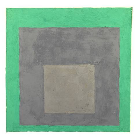
Colour is also the thematic principal of Josef Albers (1888 – 1976) who from 1949 devoted himself to a series of studies entitled Homage to the square. He uses squares of identical format that are asymmetrically superimposed in order to present different colouring and chromatic effects. Whereas the material character of colour has a crucial importance in Graubner’s work, in the works of Albers it is practically renounced. Colour is applied in a neutral manner on a homogenous surface where one can hardly discern the influence of the hand. Through the choice of colours, Albers wants to provoke an optical interaction between them.
Following Josef Albers’ aphorism that “one and one make three” Alexander Gorlizki (1967) regroups disparate elements that then create a third entity that is larger than the sum of its parts. He brings together numerous and different cultural influences and collaborates with artists and craftsmen from different domains. Gorlizki draws on old paper and parchment. His work, at once banal and mysterious with a touch of humour, is sometimes figurative and narrative, at other times based on abstract shapes and motifs.
Carole Seborovski’s (1960) works on paper produce an aesthetic outcome and show a refined execution. She seeks formal, almost mathematical perfection by giving life to the materials she employs: a broad variety of papers, tone control patches in graphite, inks, cut-outs and collages. Part of what one can see and touch corresponds with the sensuality of her work. Another invisible part, which is hidden behind these layers and beneath these cutouts initiates reflection on the meaning of symbolic shapes like the oval, the circle and the cross. These works invite the spectator to reflect upon the mysteries of nature and the fertility of life.
The sensations and perceptions felt in the face of nature are the major source of inspiration in the work of Norbert Prangenberg (1949). A certain intuitive and organic “idea of nature” is made manifest. The ensemble of Prangenberg’s work is concerned with the reciprocal relations between colour and shape. The materiality of the colour is evident and likewise present in the works on paper, oil on carton and India ink on transparent paper that are exposed at the gallery.
The greater part of the works of Jonathan Callan (1961) is derived from his fascination for materiality. He is drawn to filth, dust and objects that break. As a child he would break objects, not to see how they worked, but because he was fascinated by what was inside, to know whether it was fundamentally different from the outside. Even today the artist has a desire to see what can be found beneath the surface, under the ink of the photograph. If he scratches the surface, will something more significant be found under there? He is even tempted to go farther with the aim of finding something that tells him about the secrets of the universe.
The mysteries of the macrocosm also fascinate James Brown (1951). Since 1995, the ensemble of his work has been the prelude to the Planets series. Brown has been interested in nature and its organisation as well as the place of man and culture within it since his beginnings. In his recent works the finely nuanced colour masses revolve in a moving space. These codes created by the artist contain innumerable questions. They allow us to escape our daily lives and guide us toward the eternal mysteries of space.
Starting at the end of the 1980’s, the Chinese artist Ding Yi (1962) has exclusively devoted himself to a work around crosses of x and + that he repeats according to a systematic principle that is almost obsessive. These intertwined crosses create an impression of depth and movement. Cleared of any symbolic or narrative meaning, the work does not seek any kind of emotional expression, but is reduced to its minimal state. The simplicity of this choice is in opposition to the great variety of materials used: acrylic, pastel, charcoal and ballpoint pen. Ding Yi does not consider these works on paper as preparatory works, but as works of art in themselves.
There is a rigorous, repetitive and coherent character in the work of Pierrette Bloch (1928). Right from her beginnings she played on the almost imperceptible variations of tonality and rhythm. Her abstract work, which is made from poor materials and simple shapes, is essentially focused on space, time and movement. These works on paper include drawings and collages composed of superimposed torn paper marked with stains of India ink that she dabs in little touches at random and repetitive points.
An extraordinary artistic genius can be seen right from Louis Soutter’s (1871 – 1942) first drawings done between 1923 and 1930 in school notebooks of vegetation, architecture and descents into Hell. In these works, which may be seen as a very personal expression of suffering, dark figures are transformed by a wild rhythm and archaic musicality and black silhouettes move about on a luminous background. Besides India ink, Soutter uses printing ink and at times even shoe polish along with colours that he applies directly to the paper with his fingers in bundles of colour, stains, strokes or fingerprints.
Josef Albers, Pierrette Bloch, Louise Bourgeois, James Brown, Jonathan Callan, Tony Cragg, Ding Yi, Alexander Gorlizki, Gotthard Graubner, Henri Michaux, Norbert Prangenberg, Gideon Rubin, Carole Seborovski, Louis Soutter, Wu Yiming
The Karsten Greve Gallery is pleased to announce the opening of its exhibition On Paper, a selection of works on paper that show how contemporary artists from different horizons approach this technique. Even though there is often a certain spontaneity that emerges from works on paper, they are today considered to be entirely accomplished, full-fledged works of art. This exhibition brings together works by certain renowned artists like Josef Albers and Louise Bourgeois but also a few young talents who are exhibiting at the Karsten Greve Gallery for the first time.
For Louise Bourgeois (1911), the daily practice of drawing is an emotional necessity. Compared to sculpture, drawing is linked to a more cerebral process, which explains the constant link in her works on paper between image and text. Bourgeois’ works on paper are entirely autonomous and it is rare that a drawing has its equivalent in the form of a sculpture. She uses a wide variety of materials and numerous supports: envelopes, graph paper, musical notation paper, thank-you cards and letters. It is her way of giving importance to little every day things, which would otherwise be forgotten.
Like Louise Bourgeois, Gideon Rubin (1973) is fascinated by the passage of time and conceives his gouaches on cardboard like the pages of a diary. He looks for a way that is more immediate than traditional oil painting with his works. He often uses cardboard as a support, little pieces of thrown away cardboard that become precious through the addition of a few touches of paint. For the past few years his work has been focussed on portraits, through which he revives forgotten lives. Creating an image that gives off a certain mystery, he evokes more than he describes and gives us a feeling of “déjà vu”, the feeling of finding a forgotten image.
Gotthard Graubner (1930) found his path very early on and has followed it very coherently, developing the autonomous life of colour as his principal theme. His works have a highly sensitive meditative character and the chromatic disparities evoke a sensation of space that gives the surface of the work new dimensions. Works on paper have always had an independent status in Graubner’s work and are characterised by a generous space given to experimentation and spontaneity.
Colour is also the thematic principal of Josef Albers (1888 – 1976) who from 1949 devoted himself to a series of studies entitled Homage to the square. He uses squares of identical format that are asymmetrically superimposed in order to present different colouring and chromatic effects. Whereas the material character of colour has a crucial importance in Graubner’s work, in the works of Albers it is practically renounced. Colour is applied in a neutral manner on a homogenous surface where one can hardly discern the influence of the hand. Through the choice of colours, Albers wants to provoke an optical interaction between them.
Following Josef Albers’ aphorism that “one and one make three” Alexander Gorlizki (1967) regroups disparate elements that then create a third entity that is larger than the sum of its parts. He brings together numerous and different cultural influences and collaborates with artists and craftsmen from different domains. Gorlizki draws on old paper and parchment. His work, at once banal and mysterious with a touch of humour, is sometimes figurative and narrative, at other times based on abstract shapes and motifs.
Carole Seborovski’s (1960) works on paper produce an aesthetic outcome and show a refined execution. She seeks formal, almost mathematical perfection by giving life to the materials she employs: a broad variety of papers, tone control patches in graphite, inks, cut-outs and collages. Part of what one can see and touch corresponds with the sensuality of her work. Another invisible part, which is hidden behind these layers and beneath these cutouts initiates reflection on the meaning of symbolic shapes like the oval, the circle and the cross. These works invite the spectator to reflect upon the mysteries of nature and the fertility of life.
The sensations and perceptions felt in the face of nature are the major source of inspiration in the work of Norbert Prangenberg (1949). A certain intuitive and organic “idea of nature” is made manifest. The ensemble of Prangenberg’s work is concerned with the reciprocal relations between colour and shape. The materiality of the colour is evident and likewise present in the works on paper, oil on carton and India ink on transparent paper that are exposed at the gallery.
The greater part of the works of Jonathan Callan (1961) is derived from his fascination for materiality. He is drawn to filth, dust and objects that break. As a child he would break objects, not to see how they worked, but because he was fascinated by what was inside, to know whether it was fundamentally different from the outside. Even today the artist has a desire to see what can be found beneath the surface, under the ink of the photograph. If he scratches the surface, will something more significant be found under there? He is even tempted to go farther with the aim of finding something that tells him about the secrets of the universe.
The mysteries of the macrocosm also fascinate James Brown (1951). Since 1995, the ensemble of his work has been the prelude to the Planets series. Brown has been interested in nature and its organisation as well as the place of man and culture within it since his beginnings. In his recent works the finely nuanced colour masses revolve in a moving space. These codes created by the artist contain innumerable questions. They allow us to escape our daily lives and guide us toward the eternal mysteries of space.
Starting at the end of the 1980’s, the Chinese artist Ding Yi (1962) has exclusively devoted himself to a work around crosses of x and + that he repeats according to a systematic principle that is almost obsessive. These intertwined crosses create an impression of depth and movement. Cleared of any symbolic or narrative meaning, the work does not seek any kind of emotional expression, but is reduced to its minimal state. The simplicity of this choice is in opposition to the great variety of materials used: acrylic, pastel, charcoal and ballpoint pen. Ding Yi does not consider these works on paper as preparatory works, but as works of art in themselves.
There is a rigorous, repetitive and coherent character in the work of Pierrette Bloch (1928). Right from her beginnings she played on the almost imperceptible variations of tonality and rhythm. Her abstract work, which is made from poor materials and simple shapes, is essentially focused on space, time and movement. These works on paper include drawings and collages composed of superimposed torn paper marked with stains of India ink that she dabs in little touches at random and repetitive points.
An extraordinary artistic genius can be seen right from Louis Soutter’s (1871 – 1942) first drawings done between 1923 and 1930 in school notebooks of vegetation, architecture and descents into Hell. In these works, which may be seen as a very personal expression of suffering, dark figures are transformed by a wild rhythm and archaic musicality and black silhouettes move about on a luminous background. Besides India ink, Soutter uses printing ink and at times even shoe polish along with colours that he applies directly to the paper with his fingers in bundles of colour, stains, strokes or fingerprints.