
Thomas Mayfried
21 May - 22 Aug 2010
Thomas Mayfried
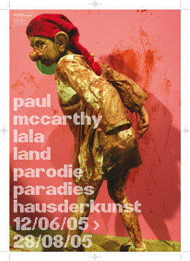
drafts and the exhibition poster ‘paul mccarthy‘, haus der kunst, 2005
images: paul mccarthy, from ‘pirate project‘, 2005
photos: ann-marie rounkle
© paul mccarthy 2005 / courtesy: hauser & wirth zürich london new york and luhring augustine new york
drafts and the exhibition poster ‘paul mccarthy‘, haus der kunst, 2005
images: paul mccarthy, from ‘pirate project‘, 2005
photos: ann-marie rounkle
© paul mccarthy 2005 / courtesy: hauser & wirth zürich london new york and luhring augustine new york
THOMAS MAYFRIED
"ephemera"
graphic design etc.
21 may 10 > 22 aug 10
in 2003, architecture, design, fashion, film and photography were added alongside the visual arts as programmatic foci in the haus der kunst. this extended programme was accompanied by a new identity designed by thomas mayfried that associated itself with cinema, theatre and circus, while also referencing the building itself.
the haus der kunst is one of the national socialist regime's first architectural propaganda projects. the historic interior architecture, as well as the original inscriptions in majuscule are largely still in existence. thomas mayfried's design introduced the opposite: lower case writing and asymmetry; in order to illustrate the idea of cinema, theatre and circus he chose a dot font, which could be combined optimally with the new corporate typeface, namely the unpretentious helvetica prevalent worldwide. an abstract version the facade was always used as a logo until 2003. though since the candid treatment of the house's history became part of the artistic programme in 2003, mayfried introduced the brand ‘hausderkunst’.
this presentation provides an insight into the designer's studio and his process of designing; it shows influences and favourites: works by william klein, alexandr rodchenko, dan graham, massimo vignelli a.o., whilst at the same time opening up the discussion on communication design for art museums by presenting idiosyncratic designs such as works by wim crouwel and mevis & van deursen for the stedelijk museum amsterdam.