Kristyan Sarkis
THE WAY I SEE IT,...
06 Apr - 05 Nov 2023

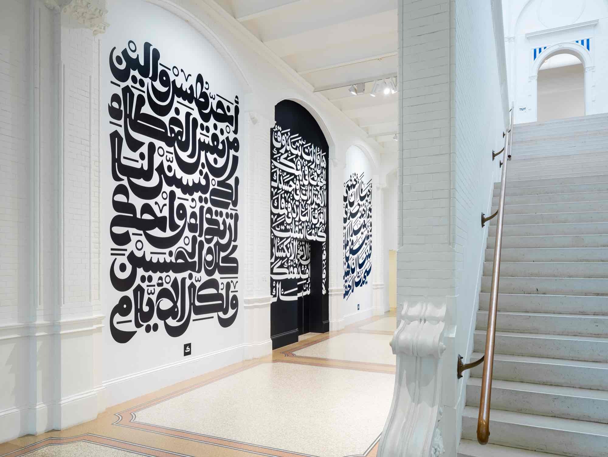
Installation view Kristyan Sarkis, The Way I See It,…, 2023, Stedelijk Museum Amsterdam. Photo: Peter Tijhuis

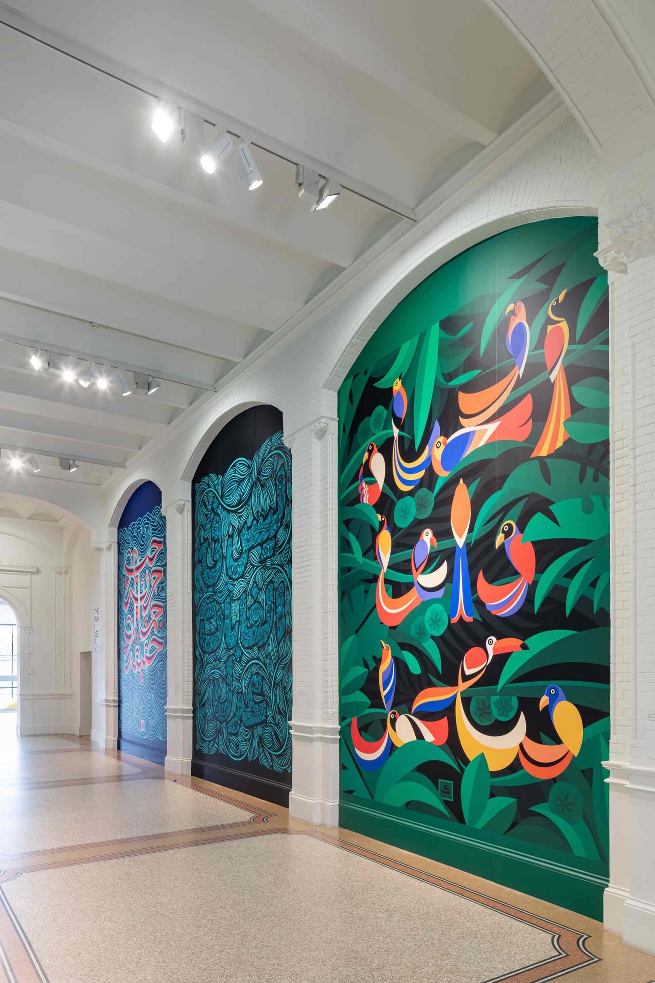
Installation view Kristyan Sarkis, The Way I See It,…, 2023, Stedelijk Museum Amsterdam. Photo: Peter Tijhuis

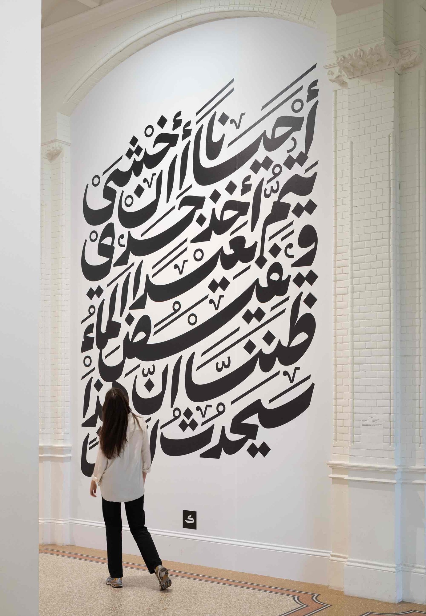
Installation view Kristyan Sarkis, The Way I See It,…, 2023, Stedelijk Museum Amsterdam. Photo: Peter Tijhuis

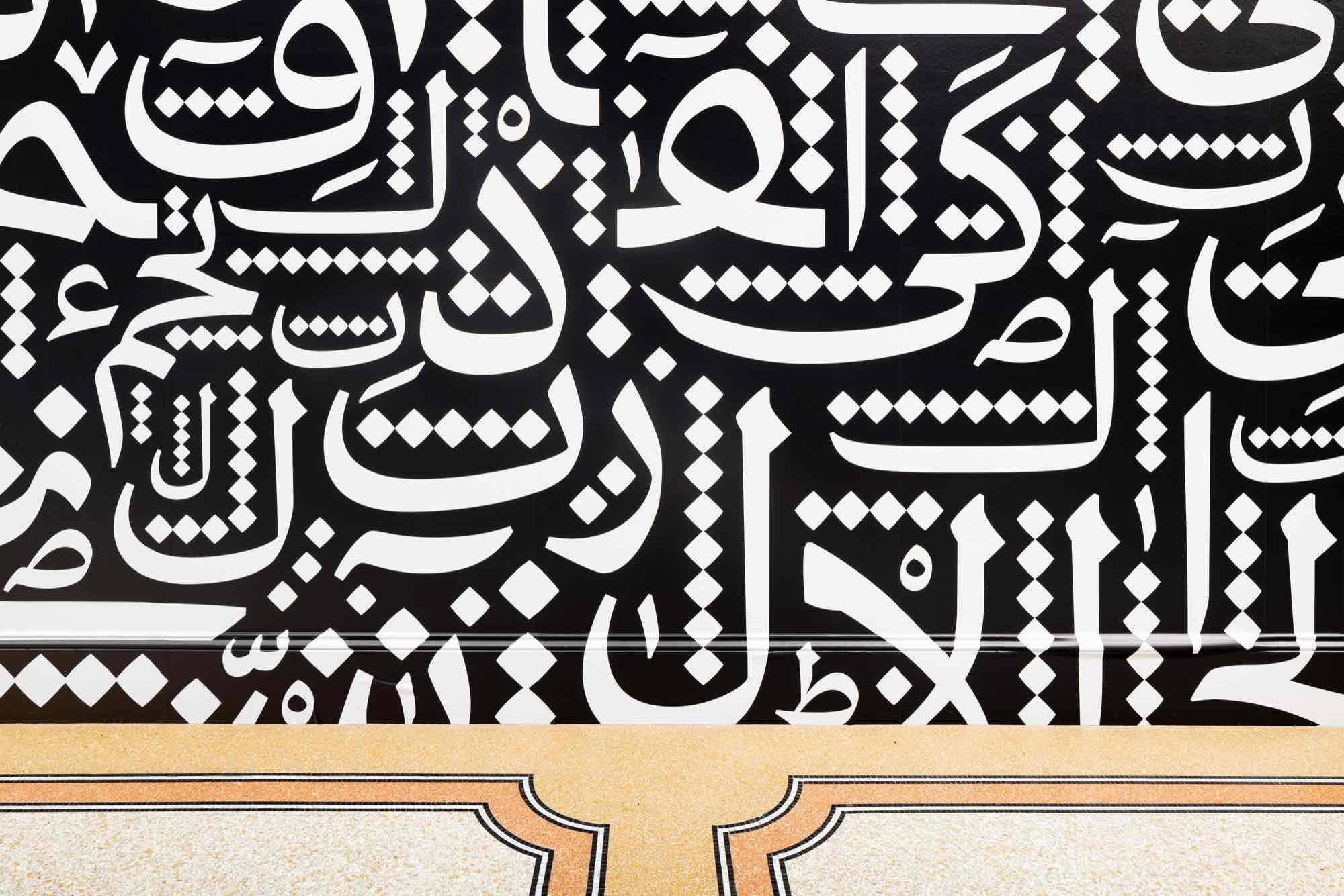
Installation view Kristyan Sarkis, The Way I See It,…, 2023, Stedelijk Museum Amsterdam. Photo: Peter Tijhuis
A picture says more than a thousand words. Type designer and lettering artist Kristyan Sarkis proves otherwise with THE WAY I SEE IT,... at the Stedelijk Museum Amsterdam. Seven letter works illustrate the imaginative power of Arabic script. In the fourth edition of POST/NO/BILLS, Sarkis fills the huge niches of the space around the historic staircase with his letter art.
Kristyan Sarkis is one of the most exciting type designers and lettering artists right now. His typography is eloquent and expressive, even for those unable to read Arabic. His typographic works often hint at the content of the text. Collaborating with the poet Hind Eljadid, he animates the energy and emotion of the poems, expressing them in the form of Arabic typography. Sarkis interprets a lyrical text about water, for instance, in liquid lines that recall the tumbling force of a waterfall. He translates a poem about the suffocating feeling of an abusive relationship into a composition made up of letters uncomfortably close together. Sarkis draws inspiration from nature, current events and Arabic typographic cultural heritage.
The Lebanese typographer lives in Amsterdam and teaches on the Master Type and Media program at the Royal Academy of Art in The Hague. Sarkis is the co-founder of TPTQ Arabic, an agency that specializes in Arabic fonts. He also co-founded Arabic Type Design Beirut, which develops educational programs dedicated to Arabic type design. Sarkis’ design practice centers around rediscovering the beauty and richness of Arabic script. He seeks contemporary forms that give Arabic script and its users a contemporary voice and agency. In this way, he attempts to see modernity as a development of one's own culture, rather than the Latin script that, from a postcolonial perspective, has been dominant.
The series POST/NO/BILLS presents the most recent graphic design projects that respond to what is currently happening in society and in the discipline.
