
Armin Hofmann
30 Aug - 28 Sep 2012
ARMIN HOFMANN
Farbe
Curtated by Fabienne Ruppen and Christof Nüssli
30 August - 28 September 2012
“It has always seemed to me that there must be a life of color as such, divorced from any object.” (Augusto Giacometti, Die Farbe und ich, 1933)—Until now, the reception of Armin Hofmann’s oeuvre has focused on this renowned Swiss graphic artist’s posters, which are largely in black and white. The exhibition at Galerie Susanna Kulli now offers the first in-depth look at his intense engagement with color. Its centerpiece is a portfolio of silkscreen prints that is unique in Hofmann’s oeuvre.
The silkscreen portfolio is complemented by writings and sketches from Hofmann’s private archive and problems he assigned in his classes. Recollections of four of his former students—Philip Burton, April Greiman, Aki Nurosi, and Moritz Zwimpfer—open up new perspectives on Hofmann’s close engagement with issues of color.
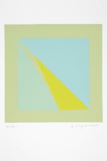
Each of the twelve plates in the portfolio, created between 1989 and 1999, shows four triangles arranged in a square. By eliminating light-dark contrasts, Hofmann was able to focus on color as such and the contrasts specific to it—cold–warm and luminous–dull, as well as contrasts in hue and quantity. As Hofmann emphasizes, the twelve plates should not be regarded as final results; they are guideposts in a process, and their order is variable. The reduction to a single problem held constant led him to a more nuanced vision and a growing awareness of the sensual qualities of color: “When you work in this manner, you become ever more refined, more sensitive.”
In his teaching, too, Hofmann sought to raise his students’ sensitivity for the qualities and effects of color.
He had no interest in imparting an authoritative system of color, striving instead to accommodate the individual element in color perception. Of particular interest in connection with the silkscreen portfolio, which Hofmann describes as “a sort of account of my pedagogical activities,” is a problem he assigned in a class in 1984. The extant sketches produced by the students and their final results bear considerable compositional and chromatic resemblance to the twelve plates in Hofmann’s portfolio.
Two case studies—of the former PTT-Areal in Arlesheim and the high school in Disentis—further illustrate Hofmann’s use of color in three dimensions. Both buildings were designed by the architects Hermann and Hans Peter Baur, early advocates of an “integration of the arts” into architecture; during the almost six decades of their collaboration with Hofmann, they frequently involved the artist in the planning process from the very outset.
Art for public spaces was the only field of his practice in which Hofmann employed color as a defining artistic element. As in the silkscreen portfolio and in his classes on color, the study of the relativity of chromatic values was central. The critical examination of the role of the mark in its context pervades Hofmann’s entire oeuvre. The engagement with color added another layer to this complex issue and may be seen as bringing further nuance and elaboration to his teaching of form.
Farbe
Curtated by Fabienne Ruppen and Christof Nüssli
30 August - 28 September 2012
“It has always seemed to me that there must be a life of color as such, divorced from any object.” (Augusto Giacometti, Die Farbe und ich, 1933)—Until now, the reception of Armin Hofmann’s oeuvre has focused on this renowned Swiss graphic artist’s posters, which are largely in black and white. The exhibition at Galerie Susanna Kulli now offers the first in-depth look at his intense engagement with color. Its centerpiece is a portfolio of silkscreen prints that is unique in Hofmann’s oeuvre.
The silkscreen portfolio is complemented by writings and sketches from Hofmann’s private archive and problems he assigned in his classes. Recollections of four of his former students—Philip Burton, April Greiman, Aki Nurosi, and Moritz Zwimpfer—open up new perspectives on Hofmann’s close engagement with issues of color.
Each of the twelve plates in the portfolio, created between 1989 and 1999, shows four triangles arranged in a square. By eliminating light-dark contrasts, Hofmann was able to focus on color as such and the contrasts specific to it—cold–warm and luminous–dull, as well as contrasts in hue and quantity. As Hofmann emphasizes, the twelve plates should not be regarded as final results; they are guideposts in a process, and their order is variable. The reduction to a single problem held constant led him to a more nuanced vision and a growing awareness of the sensual qualities of color: “When you work in this manner, you become ever more refined, more sensitive.”
In his teaching, too, Hofmann sought to raise his students’ sensitivity for the qualities and effects of color.
He had no interest in imparting an authoritative system of color, striving instead to accommodate the individual element in color perception. Of particular interest in connection with the silkscreen portfolio, which Hofmann describes as “a sort of account of my pedagogical activities,” is a problem he assigned in a class in 1984. The extant sketches produced by the students and their final results bear considerable compositional and chromatic resemblance to the twelve plates in Hofmann’s portfolio.
Two case studies—of the former PTT-Areal in Arlesheim and the high school in Disentis—further illustrate Hofmann’s use of color in three dimensions. Both buildings were designed by the architects Hermann and Hans Peter Baur, early advocates of an “integration of the arts” into architecture; during the almost six decades of their collaboration with Hofmann, they frequently involved the artist in the planning process from the very outset.
Art for public spaces was the only field of his practice in which Hofmann employed color as a defining artistic element. As in the silkscreen portfolio and in his classes on color, the study of the relativity of chromatic values was central. The critical examination of the role of the mark in its context pervades Hofmann’s entire oeuvre. The engagement with color added another layer to this complex issue and may be seen as bringing further nuance and elaboration to his teaching of form.