
The Way Beyond Art: Wider White Space: The Making Of...
14 - 25 Apr 2011
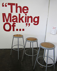
THE WAY BEYOND ART: WIDER WHITE SPACE: THE MAKING OF...
14 – 25 April, 2011
Experimental Jetset is a graphic design collective based in Amsterdam that is made up of three people: Marieke Stolk, Danny van den Dungen and Erwin Brinkers.
Experimental Jetset is Marieke, Danny and Erwin, but it is also Danny, Marieke and Erwin, and of course, Erwin, Danny and Marieke. They have collaborated since 1997.
The Making of... is a video exhibition exploring the playful, often talked about, sometimes secretive, mystique that surrounds the collaborative work-style of Experimental Jetset. The videos, shot with three cameras, by three design students, shown on three monitors, explore the three individuals behind the work, their personae, their approaches, and their quirks.
Experimental Jetset describes their work as transforming language into objects. This exhibition recontextualizes the graphic design objects of Experimental Jetset, and turns the objects back to language, and the language into objects on film.
Like Experimental Jetset, this exhibition may, or may not be a paradox. Graphic design as language and as object. This is graphic design in the context of an exhibition, under glass, and on film.
This is The Making of Experimental Jetset.
Curators: The three Wide White Space exhibitions before Experimental Jetset feature APFEL, Project Projects, and Walker. How does your work relate to these three practices?
Experimental Jetset: That's a difficult one! It's a bit dangerous to categorize other studios. We always find it awkward to hear our own studio described by others (people are either negative, or they are postive for the wrong reasons - and we don't know which is worse). So to try to describe other studios - it's a bit like walking on egg shells. We'd rather talk for ourselves.
Having said that..in general, it seems that all the studios you mention (including us) are aware of a certain tradition, and accept that they are part of this tradition. Let's call it the history of modern graphic design. It all goes back to this idea of graphic design being a discipline in which a lot of different fields overlap: art, politics, literature, industry, commerce, publishing, printing. You can look at people like El Lissitzky, Kurt Schwitters, Piet Zwart, etc., and movements such as Dada, De Stijl, Futurism, Bauhaus, etc., and you can already see a sort of blueprint of what a lot of small, independent, young studios are doing now. There seems to be a lot of emphasis on art, on typography, on language itself... And above all, an awareness of being part of this whole lineage from Early Modernism to Conceptual Art to Punk to now... And this is, more a less, the sphere in which we situate all the studios you mention. But then again, we might be all wrong; maybe some of these studios see themselves as working in a completely different sphere.
C: Can you walk us through your process of working collaboratively? How do you handle a job between the three of you?
EJ: Well, we usually talk a lot about the given subject, read a lot about it... Sending each other e-mails in the middle of the night, frantically writing back and forth... And we make a lot of sketches, and scale models - people might be surprised how much our design practice is based on handmade models, pencil drawings, and little notes on the back of envelopes and napkins. We're quite messy workers.
We never really think about how we divide the work with each other... It all goes quite naturally. We just start working, exchanging files, finishing each other's sketches, until we arrive at some sort of result, usually just in time for the printing press.
C: Are there ever times when you do work independent of Experimental Jetset? How does that work differ from what you do within Experimental Jetset?
EJ: No, we never design individually. This whole idea of working as a small collective is quite important to us. We have never felt the urge to present ourselves as individual designers. We really need each other.
C: Can you describe an aesthetic experience of your work? What do you consider to be principles of beauty in graphic design?
EJ: Well, you have to realize that we see beauty and aesthetics as two very different things. When we talk about aesthetics, we are not only talking about the compostion of shapes - for us, it also has to do with the composition of ideas, of references, of concepts... For us, the notion of aesthetics certainly doesn't refer to form alone.
Speaking for ourselves, what attracts us in other people's work is usually some sort of paradoxical quality. We enjoy work that on the one hand comes across as quite iconic, as a coherent whole, maybe even a bit authoritarian. But on the other hand, we also need that work to offer us some sort of 'escape route'; we want the work to come across not as some sort of 'godlike' entity, forced upon us from above, but as something that is clearly constructed by a human. So we like it to be alienating and 'de-alienating' at the same time, if that makes sense. Building a strong image, while simultanously destroying its own illusion.
We once read about a banner that Brecht used in a stage set. On the banner was written "Don't stare so romantically". That pretty much encapsulates what we are looking for in other people's work - be it a piece of graphic design, a piece of music, or a piece of art. We like to be kept constantly aware of the physical construction of the piece, of its context, of its material base.
And that's also what we try to do in our own work. By folding, stapling, overprinting, perforating, etc., we try to keep the reader constantly aware that they are looking at a constructed object - a piece of paper with ink printed on it.
C: During the Walker lecture in 2009, Marieke and Danny mentioned that you created the images for the first project in which the three of you worked together. Are you an illustrator? Can you talk about why there's a lack of images within Experimental Jetset's body of work?
EJ: In fact, all three of us come from fairly 'illustrative' backgrounds, in the sense that, when we were still at art school, illustration and photography were an integral part of the way in which we designed. But somehow, right after we graduated, we became more and more interested in Guy Debord's essay 'The Society of the Spectacle', and we interpreted this text in a fairy dogmatic, maybe slightly naive way. In the essay, Debord is critiquing the way in which society is more and more based on images, spectacles and projections, and the mass-alienation this causes. Being quite impressed with these ideas, we decided to cut back the use of images, and focus on typography instead. In our view, the danger of images (in the sense of illustrations, or representations) was that they capture the viewer in some sort of illusion. While typography doesn't keep the viewer captured in some sort of false representation of reality; typography only represents itself. To us, typography seemed to be more abstract (or maybe we should say more concrete), and therefore preferable to images. Typography is what it is, ink on paper. Or at least, that is what we believed around that time. (Although, paradoxically, even during the period in which we were quite dogmatically 'anti-image' in our own work, we've always loved the illustrations of others. We've always preferred our design rules to be self-imposed - it's not so that we necessarily want other people to follow them).
Nowadays, we somewhat softened up. We do integrate images in our work, although we try to use images in such a way that they always reveal their own physical construction. So, if we use a photograph, you can be sure there will be a fold through it, or a staple, or a perforation, or something like that. We really want to prevent the viewer to disappear in the image - we want him/her to be constantly aware of the printed reality. Hope this makes sense!
C: What do you think about graphic design in an art setting? The idea of "do not touch the things we've designed to be pulled out of envelopes"? What is the ideal setting for someone to experience your work (on your website where someone can read about it, first hand in it's original context, unexpectedly...)?
EJ: Well, to sketch it very briefly - there are basically two different ways in which graphic design can be exhibited in an art context (in fact, there are many different ways, but for now we just limit ourselves to these two).
In the first instance, the designer can be asked to create something specific for the exhibition. So, based on a certain theme or subject, or on the physical environment of the space, or on a given context, or on a question or brief, the designer can come up with a site-specific piece.
The second instance happens when it is decided to display, in an exhibition, graphic design that already exists - work that was originally designed for a different context. In that case, you can speak of 'recontextualization': work, made for a specific context that is shown in a completely different context. Now, in an exhibition, you can choose to either emphasize this process of 'recontextualization', or to downplay it.
By using glass showcases, or frames, or other sorts of museum-specific devices, you are emphasizing this process of 'recontextualization'; the showcase or frame becomes almost a 'time-capsule', stressing the fact that the designed piece is transported from one context to another. You can also downplay (or deny or neglect) this process of 'recontextualization', by giving the visitor some sense of 'interactivity': through reading tables, browsing experiences, multimedia simulations or interactive installations, the original context of the designed object can be recreated; or at least, this can be attempted.
To be honest, we kinda like the idea of emphasizing the recontextualization, rather than downplaying it. So personally, we have nothing against that whole "do not touch" atmosphere. A piece of design, sealed in a glass case, almost like an exotic insect - we have to admit that we kinda like that idea. Because it so clearly shows this process of 'recontextualization'. And that's the last time we'll use that word!
Then again, don't let the above answer influence your own ideas on how to display our work during your project!
Curated by Kate Koeppel, Lydia Ortiz, and Zachary Gibson